Brand refresh
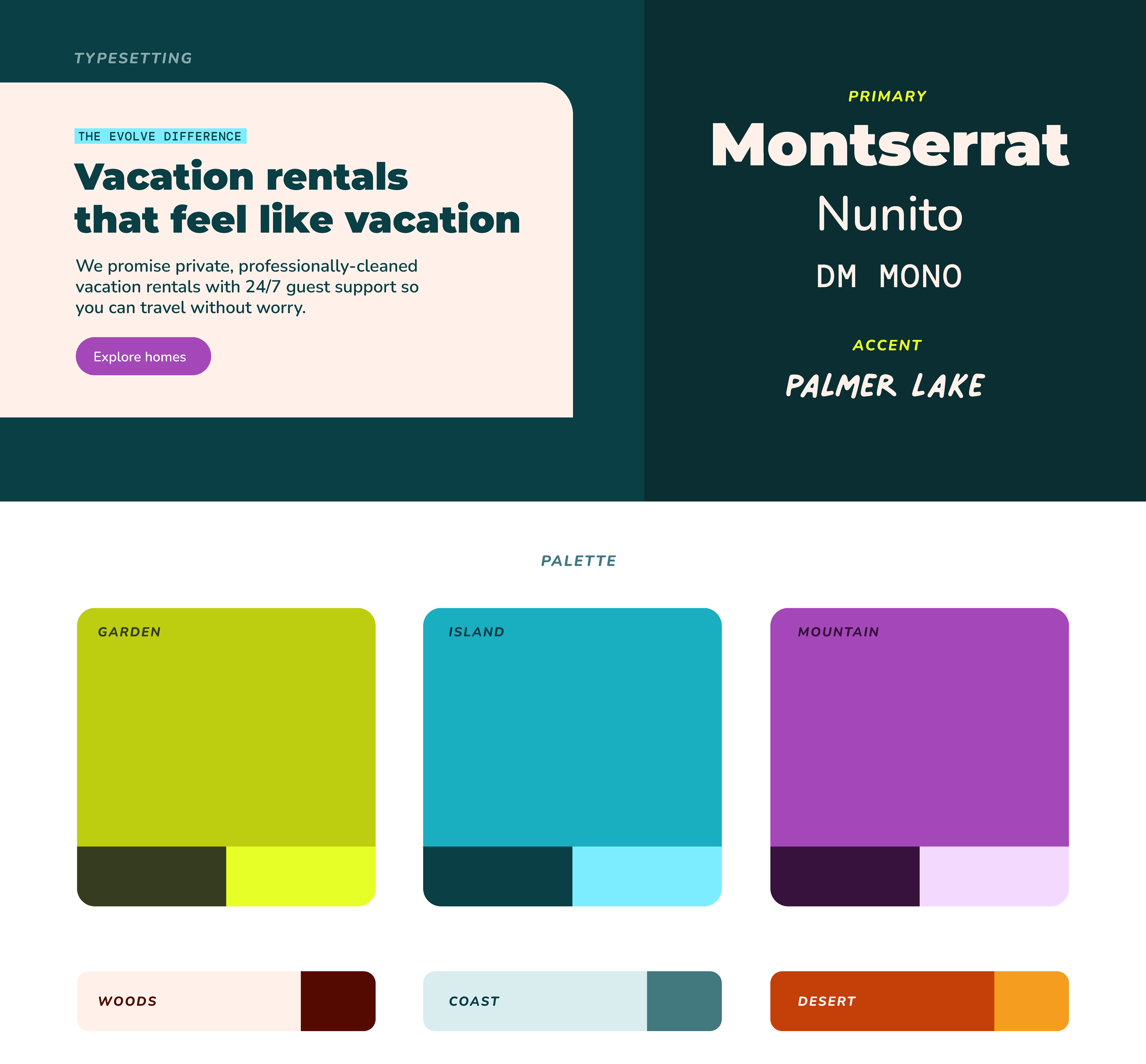
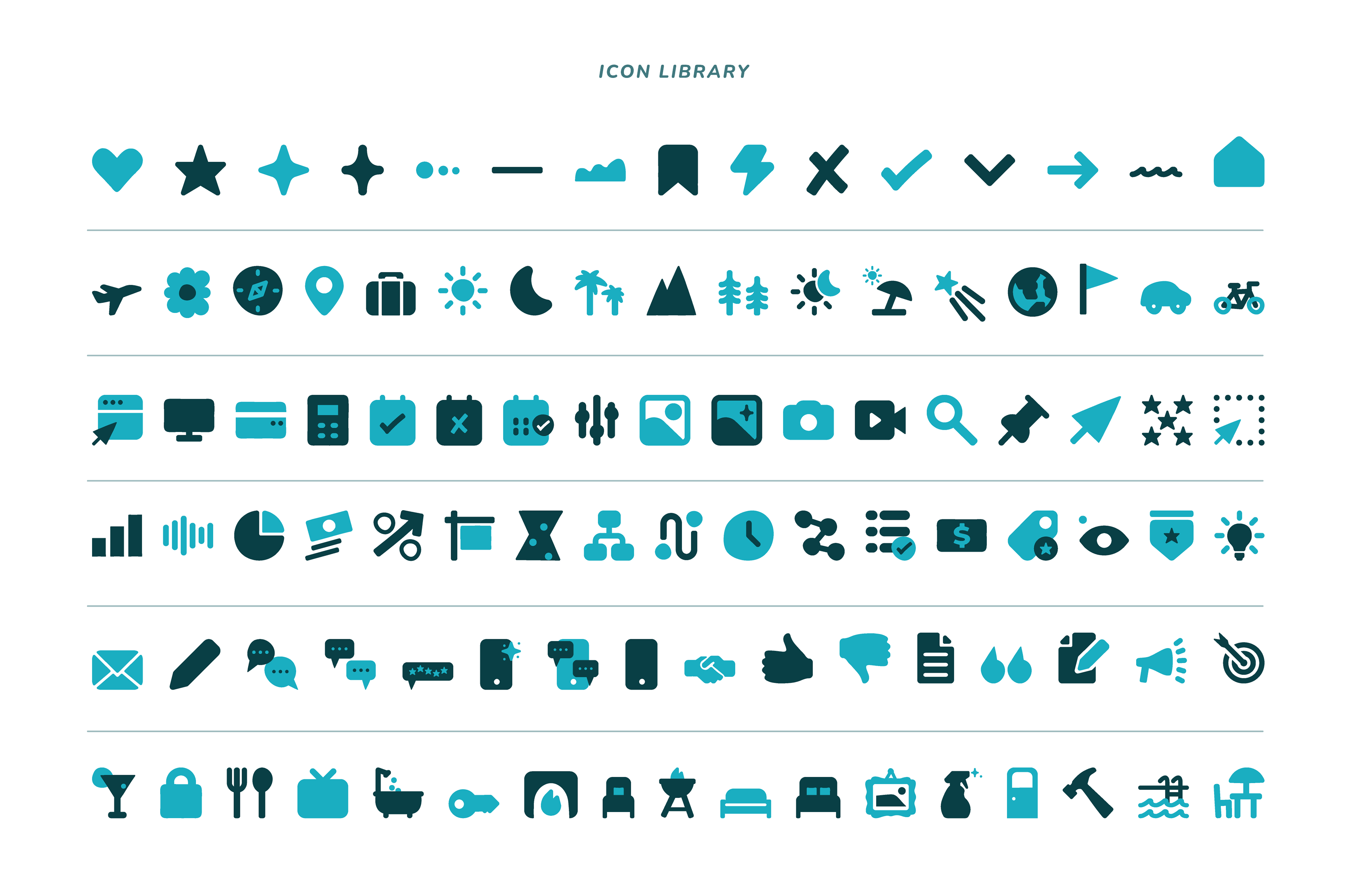
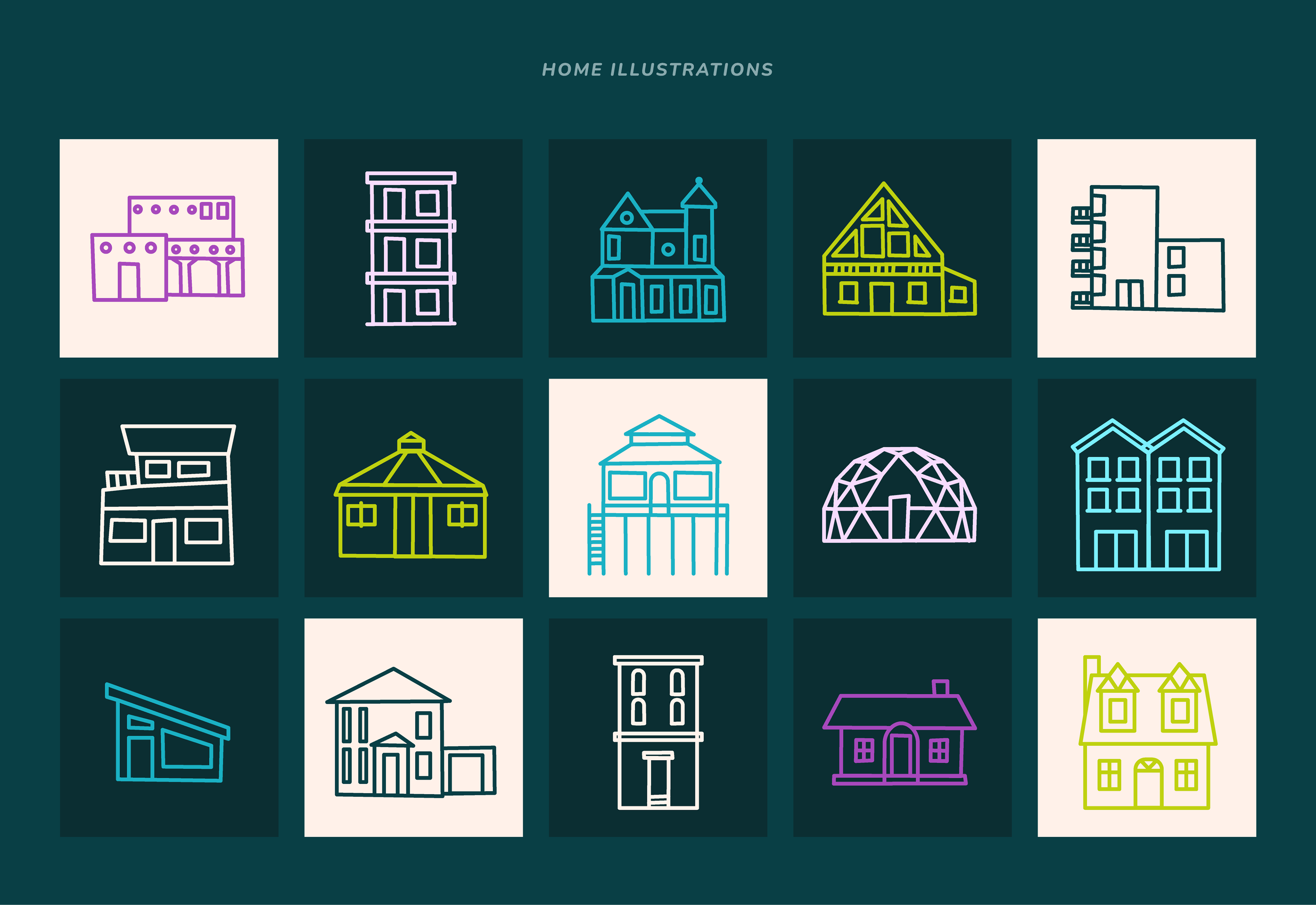
The goal was to preserve key elements of the existing brand while infusing it with a brighter and bolder feel. We maintained the core color scheme of blue and green, while injecting new life into the color palette by introducing more vibrant shades and darker tones, along with a complementary set of secondary colors. To ensure readability, we also made necessary adjustments to meet WCAG AA standards.
Creative direction by Hannah Levy Glenn.